You are using an out of date browser. It may not display this or other websites correctly.
You should upgrade or use an alternative browser.
You should upgrade or use an alternative browser.
Resolved Low contrast on some text - readability issues
- Thread starter Beline
- Start date
- Status
- Not open for further replies.


Thanks! I'm in "system" which turns out is dark mode yeah. Just had a look in light mode and I'm also struggling, but for slightly different reasons, like the red number:
Lightmode:


The strong blue/black combo is not for me, I so I'll settle on dark mode, but I think that one is more a personal preference.
Probably worth mention I'm dyslexic, the contrast might be giving me a harder time than others.
Lightmode:
The strong blue/black combo is not for me, I so I'll settle on dark mode, but I think that one is more a personal preference.
Probably worth mention I'm dyslexic, the contrast might be giving me a harder time than others.

That's more comfortable, the styling now needs rejigging to match (Next, filters, mark read, watch and such) I still think the contrast is a little low, but I can read it okay now without strain.

Thanks so much for taking the time to adjust things, I hope it's not messing with the intended vision for the css styling
Hopefully we can get a few extra opinions on it too!
Thanks so much for taking the time to adjust things, I hope it's not messing with the intended vision for the css styling
Hopefully we can get a few extra opinions on it too!
Pluky
Servitudinous
- Joined
- Apr 11, 2025
- Gender
- Female
- Pride
 Bisexual
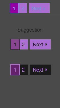
It's definitely readable but a bit obnoxious, too big too bold for pages... Sir's toy thinks the colors are really the main issue, some colors just don't work well on top of each other. Sir's toy doesn't know if there are some limitation as to the shades you can pick but here is a suggestion she deems more pleasant

- Joined
- Apr 4, 2025
I'm going to tag @Butterfly here and see what she thinks for colours.


- Status
- Not open for further replies.
Share: